
The Patchen Logo
A company logo should be more than a piece of art. A good one should be the cornerstone of the company’s marketing effort as its brand image. As with any art form, there are no hard and fast rules, but most would agree that the following basic business principles form a good place to start.
![]() THE BASICS
THE BASICS
- Be recognizable at a GLANCE.
- small or large
- full color or black & white
- distorted on wrinkled paper
- weathered by time
- displayed backward or upside down
- Be dimensional when viewed either close up or from afar
- simplicity is good, but
- elegant or complex is also good, if appearing simple from afar
- Words are good, and being too small to read from afar is also fine
- Conveys your message – like ELECTRICITY.
- Differentiates product or service from competition
- Conveys pleasant feelings, “avoiding threatening or uncertain”
- Timeless – brand name recognition
![]() THE GIANTS
THE GIANTS
In the early 1990s, I asked my good friend Noel Eberhardt to design a logo for my Christmas tree business. Knowing absolutely nothing about art and almost nothing about the retail business, I left the entire project to him. The result was a stylized rendering of the Patchen Post Office chimney with a Christmas tree in the background and a little squirrel sitting in front. I never liked it very much, but it served my purpose. I later made some feeble attempts to improve it, which made it clear that I lacked the skill required for such a project.
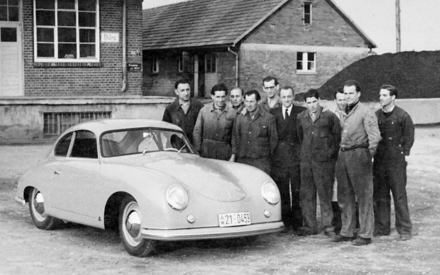 Some years later, I worked with a rather well-known designer by the name of Clarence Zierhut, who was alleged to have worked with Ferdinand Porsche on the so-called “walnut shell” design of the 1950s.
 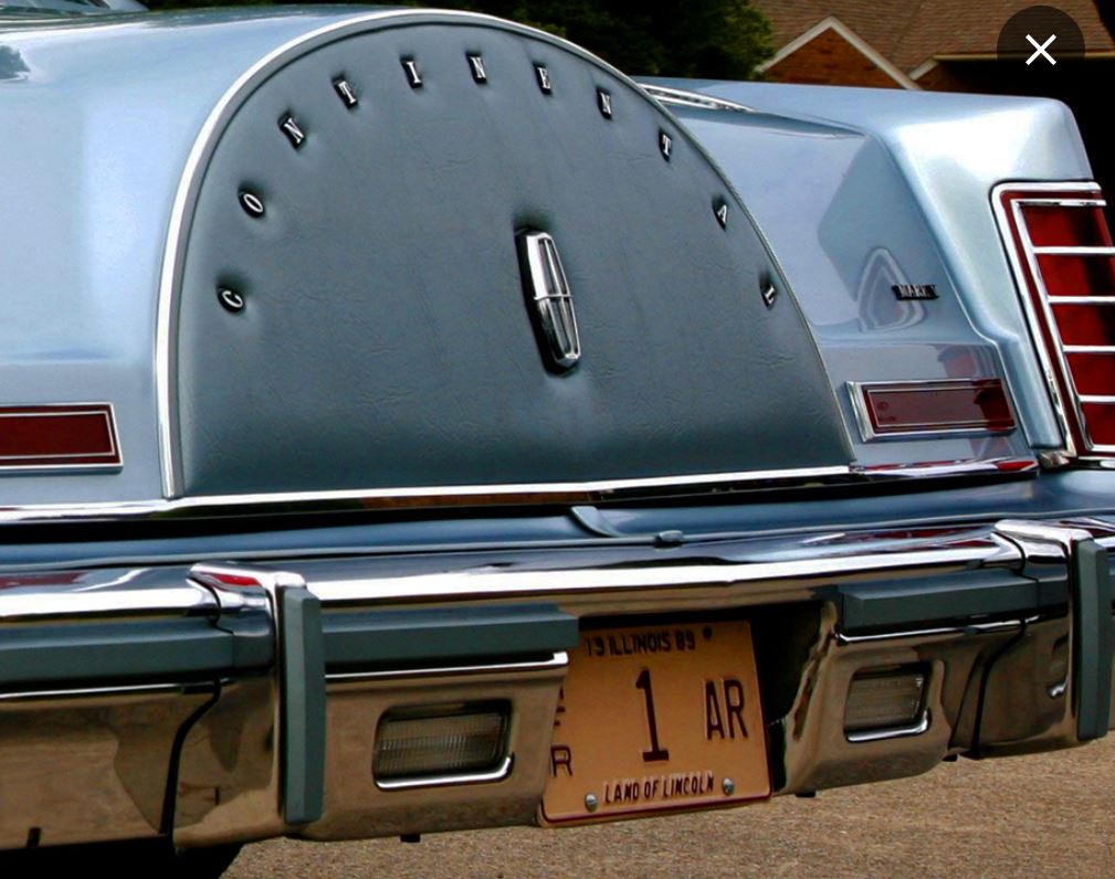 He also worked for Ford in Detroit and was at least partly responsible for the Lincoln rear-mounted spare tire design, which served the company well for decades. I cannot attest to any of his claims, but the electronic watch cases that he developed for Microma in the 1970s left a lasting imprint on the industry. Microma and I were being acquired by Timex at the time.
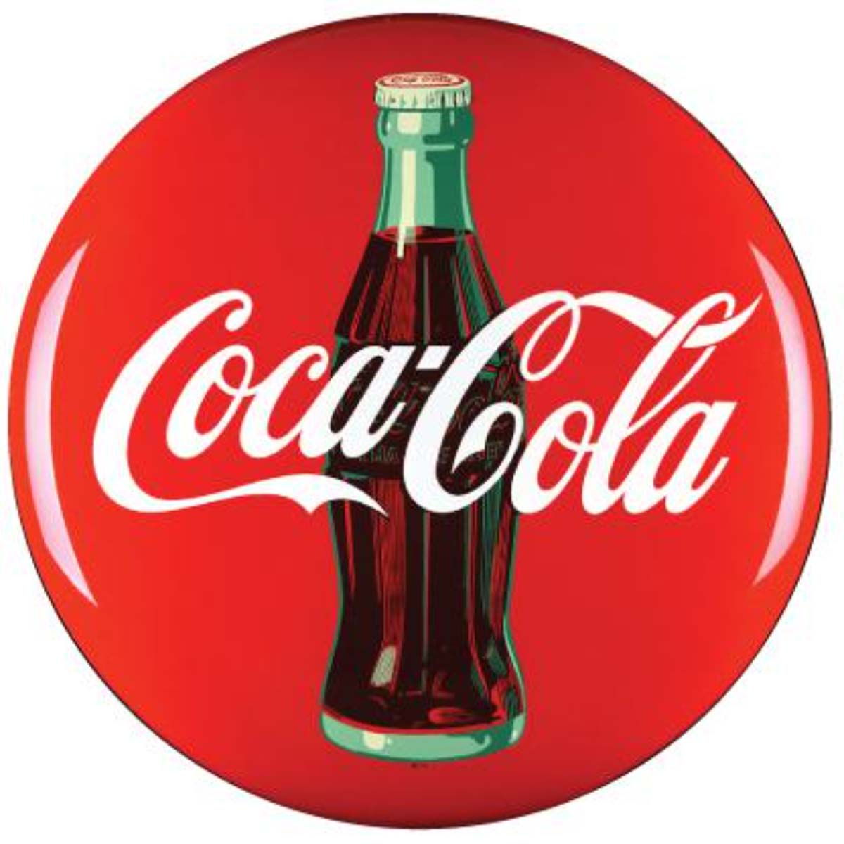
I remember Clarence saying that a good logo is like a Chinese character, in the sense that it tells a story. Unlike the Greek, Cyrillic, or other character sets, the Chinese symbols express ideas or concepts, rather than just letters and words. I must admit that I didn’t fully understand the full meaning of his comment until decades later.
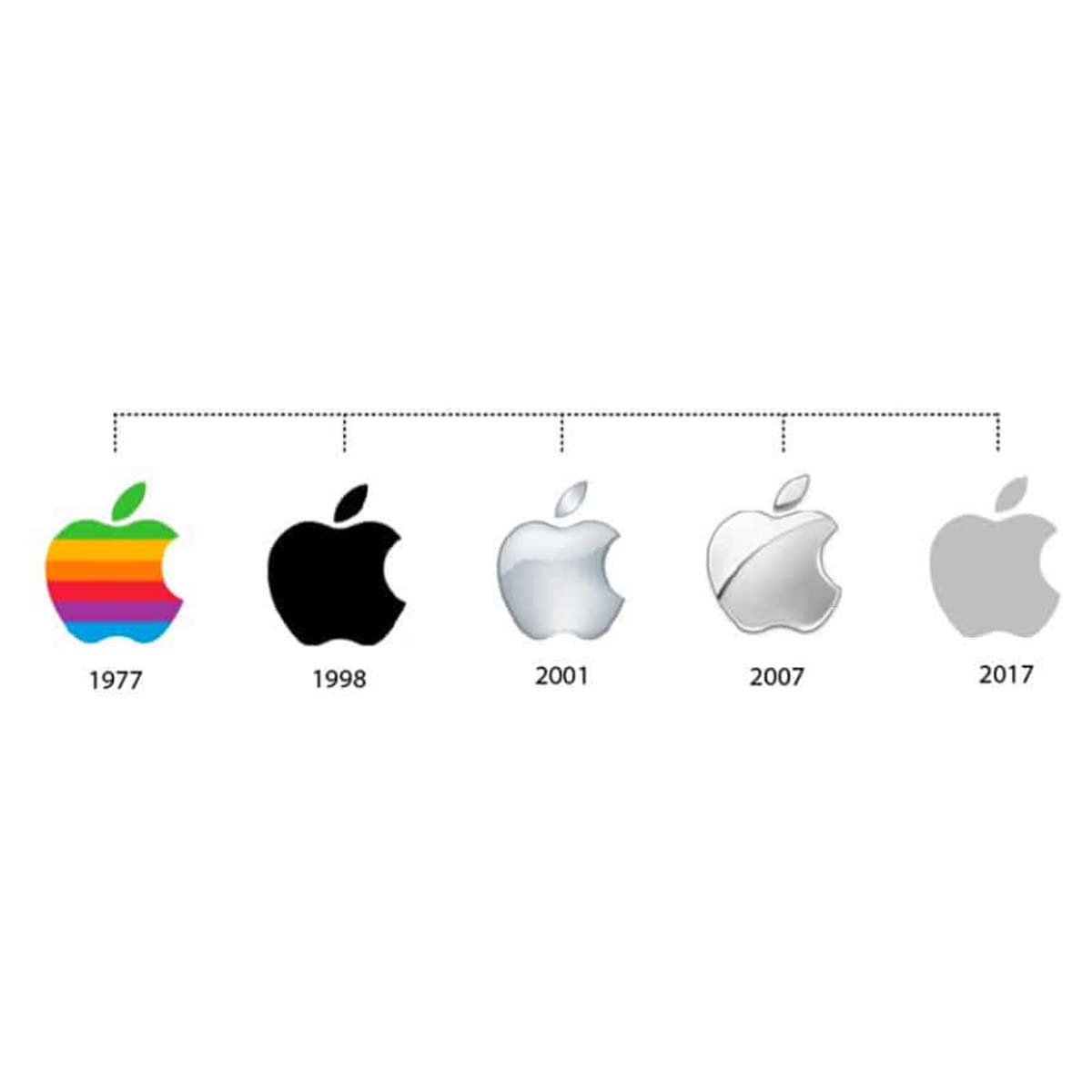
Vinny Vlasic was a graphic designer during Apple’s early years when I first met him. He has long since returned to his native Czech Republic to take over his family’s farm, but before he left, he reinforced Clarence’s ideas in me and added some of his own.
![]() THE HISTORY
THE HISTORY
Both of those experts would have agreed that any good logo design would follow the basic principles outlined above, but instead, I set their wisdom aside and allowed my Patchen logo to evolve over time. (click each icon for a closer look)
 This is the 1991 Noel Eberhardt design. There initially was a little squirrel in the foreground, which is missing in this image.
. iI added this version a short time later, suggesting that my efforts and lack of artistry could hardly be considered an improvement over Noel’s design.
. The addition of some color was an improvement, but the result was still far short of the goal.
. Adding a text block with the Company name added another dimension, but it was still not what I was looking for.
. My 2009 iteration intended to make it appear more professional on letterhead, which it did, but there was still a long way to go.
. I even hired a professional named Vinh Tran, who charged me a lot of money for little or no improvement on what I had already done.


![]() THE TOWN
THE TOWN
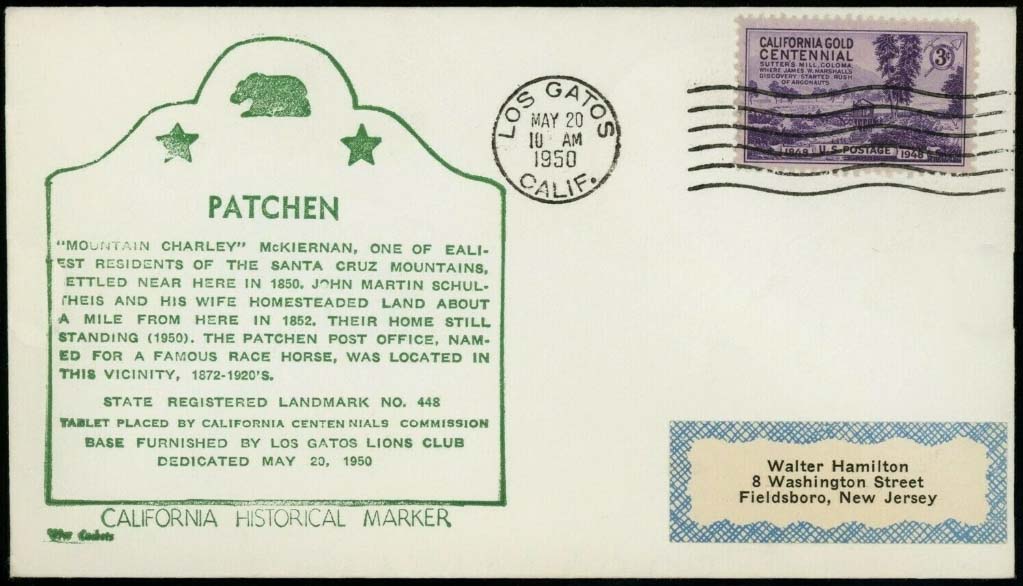 Note from the above that all previous logos contain either the exact words of, or a specific reference to[i]The chimney of the Post Office building the town named here by the Post Office Department[ii]The Post Office Department was established in 1792 and operated under that name until it was restructured and renamed to the United States Postal Service (USPS) in 1971. on March 28, 1872. The 19th-century barn that houses the business, located at a specific place on Earth[iii]37.14869 N – 121.97450 W, was reconstructed upon the very foundation of the house where the original Post Office was dedicated. The town and the Post Office have been further officially recognized by the dedication of the California Historical Landmark #448 on May 20, 1950.
The history of the town, the Post Office, this place on Earth, and the name of this Company are essential parts of its lasting uniqueness.
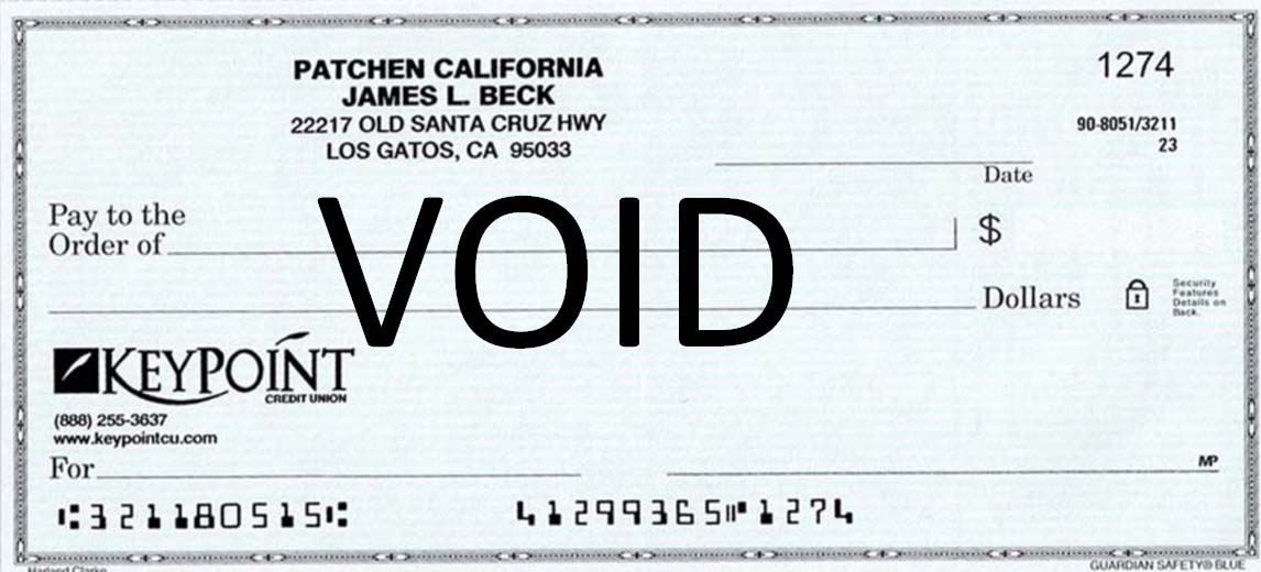
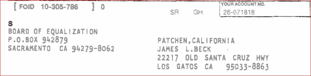
Also note that the official Company name is, and has always been “Patchen California”, sometimes written in title-case as “PATCHEN california” or similar. It is not Patchen Christmas Tree Farm, or Patchen farms, or Patchen Hot Dogs and Cold Beer Cafe, as evidenced by the bank account, the sales tax ID, and the URL.
![]() FINALLY
FINALLY
In 2010, I finally took note of what I had learned from both Clarence’s and Vinney’s tutoring. I realized that anyone looking for a nice Christmas tree at a reasonable price would be well advised to go to the Home Depot parking lot. Instead, what Patchen had been offering for decades was the experience of walking through the trees and breathing the fresh mountain air while cutting their own. Even the art of cutting became essential to the unique experience because we encouraged customers to leave a whorl of branches so a new tree could grow from the same stump. This proprietary method has made the tree an almost incidental part of the EXPERIENCE.
So with some help from Vinney, who had a side business as a freelance greeting card designer, we used what has now become known as Word Art to create the current Patchen logo. Like the Chinese characters that Clarence spoke of, Vinny’s Word Art technique told a story that people enjoyed so I took Newton’s[iv]“If I have seen further, to stand on the shoulder of those two giants.” advice and stood on the shoulders of the two giants that I had been fortunate enough to know, and laid out the first version of the current logo. I tried to integrate all of the basic marketing principles, and I was careful to avoid the mistake of many graphic designers who let their own artistic preferences overshadow those of the target audience.
Note that none of the following representations has a ring around it, because Patchen is not a ranch and the logo is not intended for branding cattle.
When times change and individual tastes vary, “A logo says what’s important, not what’s in style”.
By: Jim
Written: May, 2023
Published: May, 2023
Revised: July 14, 2025
Revised: September 2025
footnotes
| ↑i | The chimney of the Post Office building |
|---|---|
| ↑ii | The Post Office Department was established in 1792 and operated under that name until it was restructured and renamed to the United States Postal Service (USPS) in 1971. |
| ↑iii | 37.14869 N – 121.97450 W |
| ↑iv | “If I have seen further, to stand on the shoulder of those two giants.” |